Form Configuration
- Adding a New Upload Form a. Adding and Modifying Fields b. Field Addition Reminder c. Setting Up Duplicate Entry Control
- Determining Form Visibility According to Roles
- Assigning Form Usage Rights Based on User Group or Unit
- Adding Panel to Form
- Adding New Writing Form
- Additional Field for Contract Attachments
- Form Deletion
- Copying Form as New
- Making Form Active or Inactive
- Mandatory Responsible Person Panel
- Mandatory Deliveries Panel
- Adding Default Responsible Person to Document and Case Forms
- Removing Main File Field from Upload Form
- HTML Text Support in Form Elements
- Default Value Formulas for Data Transfer
- Response Document Numbers via Catalog or Case Counter
Under Form Configuration you can create different document forms and define different metadata on those forms -- according to data type and other desired criteria.
Form Configuration List View
The Admin -> Form Configuration list view allows filtering and searching forms.

- Self-Service Portal filter -- when enabled, the list shows forms that are visible in the Self-Service Portal (the "Self-service" option is checked in form settings).
- Search field -- forms can be searched by name.
- Unit column -- displays the unit name based on the form's default catalog. If the form has no default catalog, the column is empty.
- Module dropdown filter.
Filters and searches can be combined with each other.
Adding a New Upload Form
To add a new form, go to Admin -> Form Configuration. Click the Add New button.
A view opens where you need to fill in the fields under the Form Configuration panel.
Select Documents as the module.
Click the + sign next to the dropdown on the right of the Upload Method field. The system opens a form where you select Documents from the dropdown next to the Module field and Uploaded Document Category as the type.
(To add a case form, select Case View as the module, then on the form select Case View as the module and Case Form as the type).
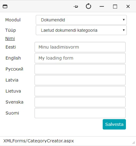 Write the upload form name in the box after the Name field. You can write the name in other languages in addition to Estonian.
Click the Save button.
The Upload Method is selected automatically, then click the Save button. The Admin -> Form Configuration view opens again.
Important
If the new form is not immediately visible in the list view, click Admin -> Form Configuration again from the module list on the left.
Now reopen the form by clicking on the new form name.
To change the name, click the pencil button -- a window opens where you can change the existing name and add the name in other languages.
 To save changes, click the Save button. The upload method with the new name is automatically selected. Then save the form again.
Adding and Modifying Fields
For a new upload form, the fields Main File and Catalog are present by default. There can be one of each per form.
If desired, these fields can be deleted and added later (for example, if you do not want these fields to be at the beginning of the form).
To see field data, click the wrench icon  next to the field. The system displays field data instead of form configuration data.
To save changes, click the green checkmark  . To delete the field, click the trash bin icon
  .
.
New fields can be added either to the right or below. To add a field below, click the downward arrow on the right of the existing field below which you want to add a field.
To add a field to the right, click the rightward arrow on the right of the existing field next to which you want to add a field.
The system displays an empty box in the location where you want to add the field and field data instead of form configuration data.
 See also Form Creation (KOVMEN).
Adding Text Field
-
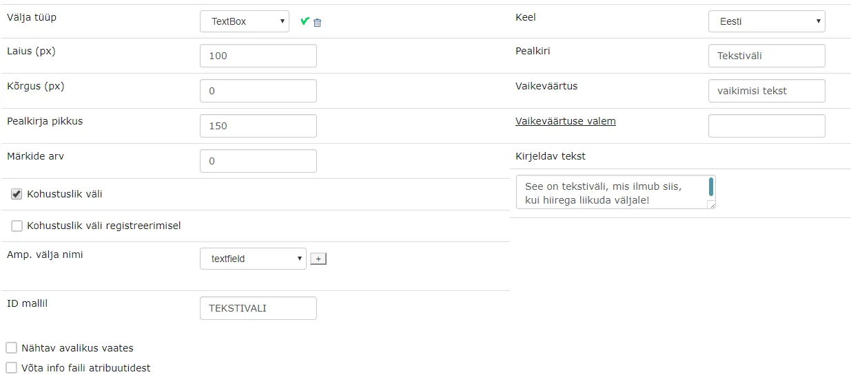
To add a text field, select TextBox as the field type.
-
To change the text field (box) width, enter the desired width in the area (box) next to the Width field.
-
To change the text field (box) height, enter the desired height in the area (box) next to the Height field. With value 0, the height is set by default.
-
If you want to change the length of the area between the field name and the box, enter the desired length in the area (box) next to the Title Length field.
-
You can set the maximum number of characters by entering the desired number in the box next to the Character Count field (if you do not want to define a specific length, you can leave the default value 0).
-
If you want to make filling the field mandatory, check the box next to Mandatory Field.
-
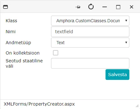
It's mandatory to fill the Amp. Field Name field. If there's no suitable name in the dropdown, click the + sign next to the box on the right of the field.
-
The system opens a form where you need to define the data type and write the field name in English.
-
For field type "TextBox", the data type is Text. Click the Save button.
-
Now search for the created field in the Amp. Field Name dropdown.
 * Write the field name you want to see on the form in the box next to the Title field.
-
You can write the title in other languages in addition to Estonian by selecting another language from the dropdown next to the Language field and then writing the Title field name in that language.
-
If you want to add a default value, write the desired default value in the Default Value field.
-
Write text in the area next to the Descriptive Text field that will be displayed when hovering over the text field.
-
If the field is to be used in a template, fill in the Template ID field. The ID should be named in uppercase letters without spaces or special characters (e.g., TEXTFIELD).
-
To add the field to the form, click the green checkmark.
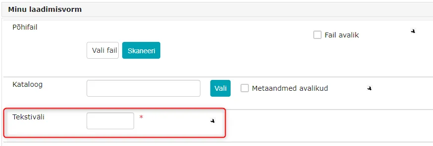
 As a result, a new field has been added to the form.
Adding Separator Panel
-
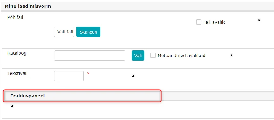
If you want to add a new separator panel (a gray field with text), select Caption (heading) as the field type.
-
Write the desired panel name in the area (box) to the right of the Title field.
-
You can write the title in other languages in addition to Estonian by selecting another language from the dropdown next to the Language field and writing the panel name in the area (box) next to the Title field in that language.
-
To save, click the green checkmark.
Adding Checkbox
-
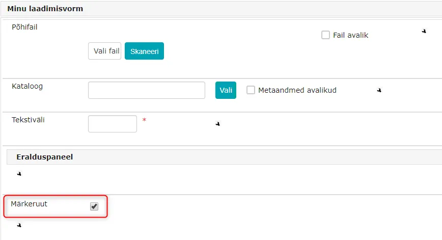
To add a Checkbox, select CheckBox as the field type.
-
You can change the title length by entering the desired length in the area (box) next to the Title Length field.
-
It's mandatory to fill the Amp. Field Name field. If there's no suitable name in the dropdown, click the + sign next to the box on the right of the field.
-
The system opens a form where you need to define the data type and write the field name. For checkbox, the data type is Yes/No.
-
Write the field name in the box next to the Name field. Click the Save button.
-
Write the field name you want to see on the form in the box next to the Title field.
-
You can write the title in other languages in addition to Estonian by selecting another language from the dropdown next to the Language field and then writing the panel name in the area (box) next to the Title field in that language.
-
You can set a default value for the checkbox by checking the box next to the Default Value field.
-
You can write text in the area next to the Descriptive Text field that will be displayed when hovering over the checkbox.
-
To add the field to the form, click the green checkmark.
Adding Checkbox List
-
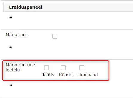
If you want more than 1 checkbox, select CheckBoxList as the field type.
-
Option to set the length of the area between checkboxes by entering the desired width in the area (box) next to the Width field. With Width field value 0, the width value is set by default.
-
If you want to change the title length, enter the desired length in the area (box) next to the Title Length field.
-
If you want to make filling the field mandatory, check the box next to Mandatory Field.
-
It's mandatory to fill the Amp. Field Name field. If there's no suitable name in the dropdown, click the + sign next to the box on the right of the field.
-
The system opens a form where you need to define the data type and write the field name in English.
-
For checkbox list, the data type is Array. Write the field name in the box next to the Name field, click the Save button.
-
Write the field name you want to see on the form in the box next to the Title field.
-
You can write the title in other languages in addition to Estonian by selecting another language from the dropdown next to the Language field and then writing the panel name in the area (box) next to the Title field in that language.
-
The box under the Options field displays the options that will be shown in the checkbox list.
-
Under the box below the Options field, there's a dropdown where you select the name of the new checkbox list element to be added and then click the Add button. The selected field name appeared in the box under the Options field.
-
If the desired checkbox list element name is not in the dropdown, you can add a new one by clicking the Add New button. A window opens where you can write the value in other languages in addition to Estonian. Click the Save button.
-
If you want to change the name of an element in the checkbox list, click on the element name and then the Edit button. A window opens where you can change values. Click the Save button.
-
It's possible to make a checkbox list element inactive by clicking on the element name and then the Inactive/Active button.
-
If a checkbox list element is inactive, inactive is displayed in parentheses after the element. To make it active again, click on the element name and then the Inactive/Active button.
-
If a checkbox list element is active, the word inactive disappears from the parentheses after the element.
-
You can write text in the area next to the Descriptive Text field that will be displayed when hovering over the checkbox list.
-
To add the field to the form, click the green checkmark.
Adding Classificator and Classificator List
-
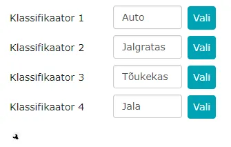
To add a classificator to the form, select Classificator(>50) as the field type.
-
To add a classificator list to the form, select ClassificatorList(>50) as the field type.
-
If you want to make multiple selections, check the box next to Multiple Selection.
-
Multiple selection can be either related or sequential selection, check the desired radio button option.
-
Select 2, 3, 4, or 5 as the number of related fields from the dropdown next to Number of Related Fields.
-
According to the number of related fields, the system displays Width fields, write the desired widths in the boxes after the fields.
-
If you want to make filling the field mandatory, check the box next to Mandatory Field.
-
If you want to change the title length, enter the desired length in the area (box) next to the Title Length field.
-
It's mandatory to fill the Amp. Field Name field. If there's no suitable name in the dropdown, click the + sign next to the box on the right of the field.
-
The system opens a form where you need to define the data type and write the field name in English. For classificator, the data type is Array.
-
Write the English field name in the box next to the Name field. Click the Save button.
-
Write the field names you want to see on the form in the boxes next to the Title fields.
-
If you don't want the title to be displayed, uncheck the box to the right of the box next to the Title field.
-
You can write text in the area next to the Descriptive Text field that will be displayed when hovering over the field.
-
To add options, click the Add/Edit Options button below the Descriptive Text field.
-
The system opens a form where you can write names for each related field in other languages in addition to Estonian. Click the Add button.
-
You can change the order of added options by moving options up or down using the arrows at the end of the rows.
-
To edit an option, click the pencil icon at the end of the option row; to delete an option, click the trash bin icon.
Adding Date
-
To add a date, select Date as the field type.
-
Option to set the box width by entering the desired width in the area (box) next to the Width field. With Width field value 0, the width value is set by default.
-
If you want to change the title length, enter the desired length in the area (box) next to the Title Length field.
-
If you want to make filling the field mandatory, check the box next to Mandatory Field.
-
It's mandatory to fill the Amp. Field Name field. If there's no suitable name in the dropdown, click the + sign next to the box on the right of the field.
-
The system opens a form where you need to define the data type and write the field name in English. For date, the data type is Date.
-
Write the English field name in the box next to the Name field. Click the Save button.
-
Write the field name you want to see on the form in the box next to the Title field.
-
You can also set a default value by clicking the Select button next to the area (box) to the right of the Default Value field.
-
The system opens the Select Date form. Click on the desired date name. The system closes the Select Date form and fills the area (box) to the right of the Default Value field with the selected date.
-
You can set a default value formula by entering the formula in the area (box) next to the Default Value Formula field:
- If you write DATE, the default value is the current date
- If you write DATE+1D, 1 day is added to the current date.
- If you write DATE+1M, 1 month is added to the current month.
- If you write DATE+1Y, 1 year is added to the current year.
- If you write =15THOFNEXTFULLMONTH, the default value is either the 15th of the next month (if the document is registered on the 1st--15th of the month) or the 15th of the month after next (if registered on the 16th--31st). This formula can be used on the "Document deadline" field.
-
You can write text in the area next to the Descriptive Text field that will be displayed when hovering over the date field.
-
To add the field to the form, click the green checkmark.

Adding Deadline Field Type
- The Deadline field type works similarly to the date field but is designed for deadlines. A Deadline-type field can be used in searches, templates, and all other Amphora views.
- The default value formulas (DATE, DATE+1D, DATE+1M, DATE+1Y, =15THOFNEXTFULLMONTH) also work with the Deadline field type.
Adding Date and Time
-
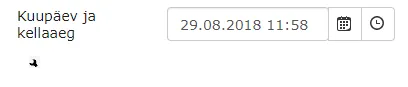
If you want to add date and time, select DateTime as the field type.
-
Option to set the box length by entering the desired width in the area (box) next to the Width field. With Width field value 0, the width value is set by default.
-
If you want to change the title length, enter the desired length in the area (box) next to the Title Length field.
-
If you want to make filling the field mandatory, check the box next to Mandatory Field.
-
It's mandatory to fill the Amp. Field Name field. If there's no suitable name in the dropdown, click the + sign next to the box on the right of the field.
-
The system opens a form where you need to define the data type and write the field name in English. For field type DateTime, the data type is Date. Write the English field name in the box next to the Name field and click the Save button.
-
Write the field name you want to see on the form in the box next to the Title field.
-
You can also set a default value by clicking the Select button next to the area (box) to the right of the Default Value field.
-
The system opens the Select Date form. Click on the desired date name. The system closes the Select Date form and fills the area (box) to the right of the Default Value field with the selected date.
-
By selecting the clock symbol, a list of times opens where you can select the desired time.
-
You can also set a default value formula by entering the formula in the area (box) next to the Default Value Formula field:
- If you write DATE, the default value is the current date
- If you write DATE+1D, 1 day is added to the current date.
- If you write DATE+1M, 1 month is added to the current month.
- If you write DATE+1Y, 1 year is added to the current year.
-
You can write text in the area next to the Descriptive Text field that will be displayed when hovering over the field.
-
To add the field to the form, click the green checkmark.
Adding Dropdown Menu
-
If you want to add dropdown menus to the form, select DropDownList as the field type.
-
Option to set the box width by entering the desired width in the area (box) next to the Width field. With Width field value 0, the width value is set by default.
-
If you want to change the title length, enter the desired length in the area (box) next to the Title length field.
-
If you want to make filling the field mandatory, check the box next to Mandatory Field.
-
It's mandatory to fill the Amp. Field Name field. If there's no suitable name in the dropdown, click the + sign next to the box on the right of the field.
-
The system opens a form where you need to define the data type and write the field name in English. For field type DropDownList, the data type is Number. Click the Save button.
-
Write the field name you want to see on the form in the box next to the Title field.
-
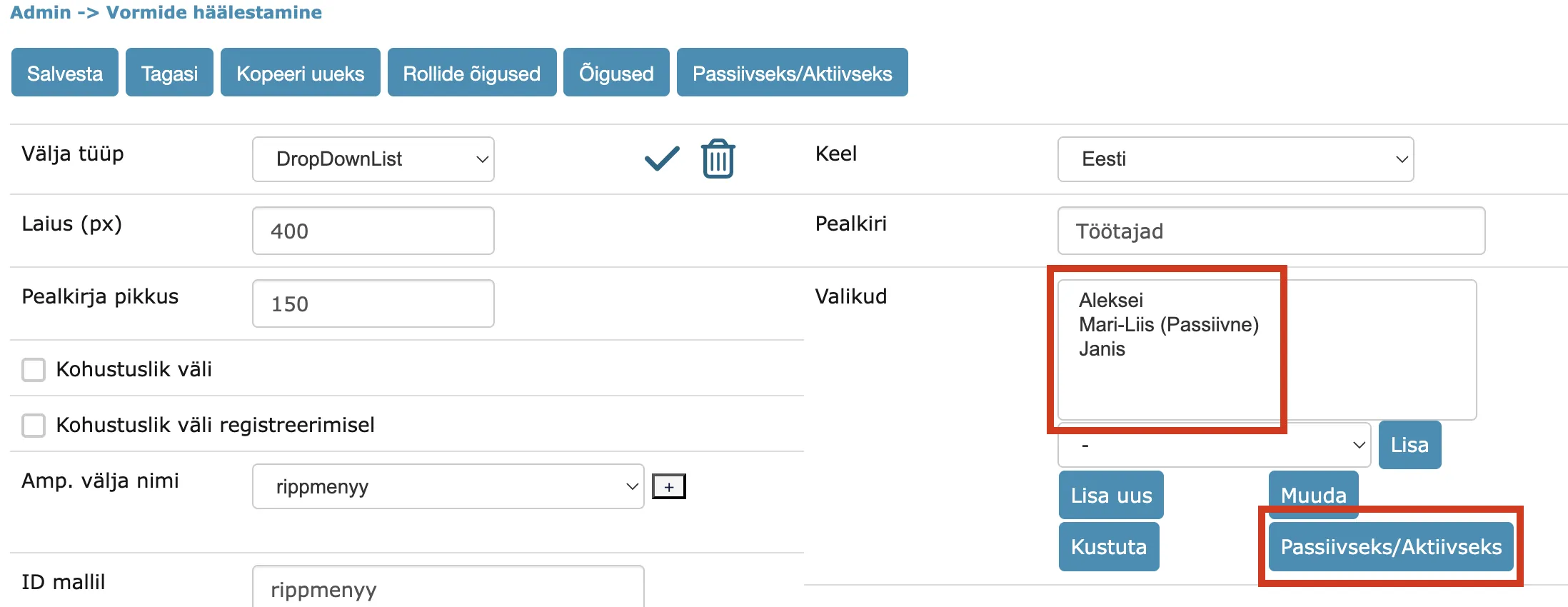
The box under the Options field displays the options that will be shown in the dropdown menu.
-
Under the box below the Options field, there's a dropdown where you select the name of the new dropdown menu element to be added and then click the Add button. The selected field name appeared in the box under the Options field.
-
If the desired dropdown menu element name is not in the dropdown, you can add a new one by clicking the Add New button. The system opens a form where you can write the dropdown menu element name in other languages in addition to Estonian. Click the Save button.
-
To edit a dropdown menu element, click on the dropdown menu element and then the Edit button. The system opens a form where you can change the dropdown menu element name in Estonian and other languages. Click the Save button.
-
To delete a dropdown menu element, click on the dropdown menu element and then the Delete button.
-
It's also possible to make an element inactive by clicking on the element name and then the Inactive/Active button.
-
If an element is inactive, it is not displayed in the dropdown menu on the document form. Documents where the now-inactive value was previously selected will still show that value -- existing data is not lost. The inactive value is also removed from the default value selection. If you want to make the element active again, click on the element name and the Inactive/Active button.
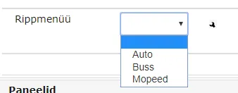
Dropdown menu options on the document edit view (inactive values are not visible):

-
If you want to set a default value, select the appropriate default value from the dropdown next to the Default Value field.
-
You can write text in the area next to the Descriptive Text field that will be displayed when hovering over the dropdown menu.
-
To add the field to the form, click the green checkmark.
Adding File Selection
-
There can be one file selection on the form. It's displayed at the very beginning of the form.
-
If you want the file selection field not to be at the beginning of the form but below, you need to delete the existing field.
-
To do this, click the wrench icon
 . The system opens field data instead of form configuration data. To delete the field, click the trash bin icon
  .
. -
When adding a new file selection, select FileChooser as the field type.
-
Option to set the box width by entering the desired width in the area (box) next to the Width field. With Width field value 0, the width value is set by default.
-
If you want to change the title length, enter the desired length in the area (box) next to the Title Length field.
-
If you want to make filling the field mandatory, check the box next to Mandatory Field.
-
Write the field name you want to see on the form in the box next to the Title field.
-
You can write text in the area next to the Descriptive Text field that will be displayed when hovering over the file selection field.
-
To add the field to the form, click the green checkmark.

Adding Catalog Selection
-
There can be one catalog selection on the form. It's displayed at the very beginning of the form after file selection.
-
If you want the file selection field not to be at the beginning of the form but below, you need to delete the existing field.
-
To do this, click the wrench icon
. The system opens field data instead of form configuration data. To delete the field, click the trash bin icon . -
When adding a new catalog selection, select FolderChooser as the field type.
-
Option to set the box width by entering the desired width in the area (box) next to the Width field. With Width field value 0, the width value is set by default.
-
If you want to change the title length, enter the desired length in the area (box) next to the Title Length field.
-
If you want to make filling the field mandatory, check the box next to Mandatory Field.
-
Write the field name you want to see on the form in the box next to the Title field.
-
You can write text in the area next to the Descriptive Text field that will be displayed when hovering over the radio buttons.
-
To add the field to the form, click the green checkmark.

Adding Person Selection
-
To add person selection, select PersonChooser as the field type.
-
Option to set field width by entering the desired value in the Width field.
-
If you want to change the title length, enter the desired length in the area (box) next to the Title Length field.
-
If you want to make filling the field mandatory, check the box next to Mandatory Field.
-
It's mandatory to fill the Amp. Field Name field. If there's no suitable name in the dropdown, click the + sign next to the box on the right of the field.
-
The system opens a form where you need to define the data type and write the field name in English. For field type PersonChooser, the data type is Number. Click the Save button.
-
Write the field name you want to see on the form in the box next to the Title field.
-
Option to set a default value by selecting the desired default value from the dropdown next to the Default Value field.
-
You can write text in the area next to the Descriptive Text field that will be displayed when hovering over the person selection dropdown.
-
To add the field to the form, click the green checkmark.
-
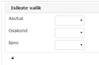
The system adds a panel to the form with 3 dropdowns: Organization, Department, and Name
Adding Multiple Person Selection
-
If you need to be able to select more than 1 person, you need to select PersonChooserList as the field type.
-
Option to set field width by entering the desired value in the Width field. Option to set field height by entering the desired value in the Height field.
-
If you want to change the title length, enter the desired length in the area (box) next to the Title Length field.
-
You can also set the maximum number of characters by entering the desired number of characters in the box next to the Character Count field.
-
If you want to make filling the field mandatory, check the box next to Mandatory Field.
-
It's mandatory to fill the Amp. Field Name field. If there's no suitable name in the dropdown, click the + sign next to the box on the right of the field.
-
The system opens a form where you need to define the data type and write the field name in English. For field type PersonChooserList, the data type is Array. Click the Save button.
-
Write the field name you want to see on the form in the box next to the Title field.
-
Option to set a default value by selecting the desired default value from the dropdown next to the Default Value field.
-
You can write text in the area next to the Descriptive Text field that will be displayed when hovering over the person selection.
-
To add the field to the form, click the green checkmark.

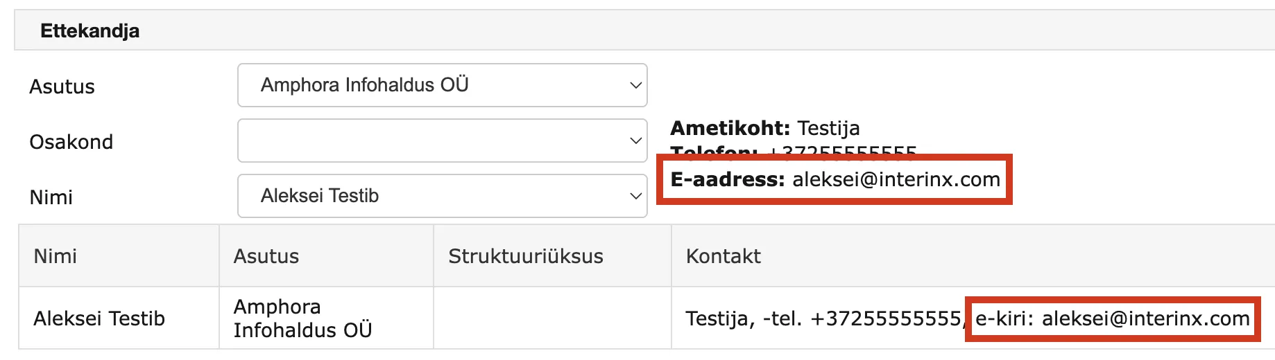
The PersonChooserList form element displays various data about the selected person -- email address, phone number, position, etc. Only the email address designated as the primary address is shown for the selected person. Other addresses (e.g., personal email address) are not displayed.
Adding Radio Buttons
-
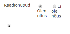
If you want to add radio buttons, you need to select RadioButtonList as the field type.
-
Option to set the length of the area between radio buttons by entering the desired width in the area (box) next to the Width field.
-
If you want to change the title length, enter the desired length in the area (box) next to the Title Length field.
-
If you want to make filling the field mandatory, check the box next to Mandatory Field.
-
It's mandatory to fill the Amp. Field Name field. If there's no suitable name in the dropdown, click the + sign next to the box on the right of the field.
-
The system opens a form where you need to define the data type and write the field name in English. For field type "RadioButtonList", the data type is Number. Click the Save button.
-
Write the field name you want to see on the form in the box next to the Title field.
-
The box under the Options field displays the options that will be shown in the radio button list.
-
Under the box below the Options field, there's a dropdown where you select the name of the new radio button to be added and then click the Add button. The selected field name appeared in the box under the Options field.
-
If the desired radio button name is not in the dropdown, you can add a new one by clicking the Add New button.
-
A window opens where you can write the value in other languages in addition to Estonian. Click the Save button. The cancel button restores the previous saved state.
-
If you want to change the radio button name, click on the radio button name and then the Edit button. A window opens where you can change values. Click the save button.
-
It's possible to make a radio button inactive by clicking on the radio button name and then the Inactive/Active button.
-
If a radio button is inactive, inactive is displayed in parentheses after the element. To make it active again, click on the radio button name and then the Inactive/Active button.
-
If a radio button is active, the word inactive disappears from the parentheses after the radio button name.
-
Option to set a default value by selecting the desired default value from the dropdown next to the Default Value field.
-
You can write text in the area next to the Descriptive Text field that will be displayed when hovering over the radio buttons.
-
To add the field to the form, click the green checkmark.
Field Addition Reminder
-
Data field name must start with a letter without diacritics and may only contain letters without diacritics, numbers, and underscores.
-
If documents/cases have already been added through the created form, fields should not be deleted or particularly modified. As a result of such modification and deletion, existing data may be lost.
-
Within one form, the same Amphora field name cannot be used more than once.
-
If a print form has been added to the form or data is added to this form through email registration, these must also be changed after modifying the form.
-
You cannot remove a form element from the form if it's used in email registration.
-
You cannot delete a form if documents or cases have been added with the form and they have not been previously removed from the system (objects must also be removed from the trash to make their restoration impossible).
Setting Up Duplicate Entry Control
By checking the Duplicate Entry Control box, it's possible to check when saving whether a document with such field content has already been previously saved to Amphora.
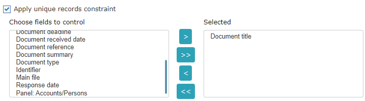 To add duplicate entry control to a form, open the saved form by clicking on the saved form title in the form list in Admin -> Form Configuration.
Select the fields to be controlled, if necessary check the Show previously entered objects box and select fields (fields of previously saved documents) whose content is displayed if a conflict occurs when checking duplicate entries. To do this, select the field name from the dropdown and click the Add button; to remove, click the Remove button.
To save, click the Save button.
Determining Form Visibility According to Roles
Click on the Admin module in the left menu of the system. From the opened submenu, click the Form Configuration link.
Click on the form name, the system displays the form configuration data saved in Admin -> Form Configuration.
Click the Role Rights button. In the opened form, click on the role name and then the > button next to the Selected box.
To make the form displayed by default for the role, click on the role name and click the > button next to Display Form as Default Form.
Selection made, click the Save button.
To save form changes, click the Save button.
Assigning Form Usage Rights Based on User Group or Unit
In Amphora, you can restrict form visibility so that only certain units or user groups can see and use it. To do this, open the desired form by going to Admin -> Form Configuration -> click on the form name. In the form configuration view, click Rights in the button row at the top.
 Then you can determine which units and user groups have access to the given form. Here you can
1. Sort units;
2. Sort user groups;
3. Select whether the unit or user group has "Allowed" or "Forbidden" to use this form.
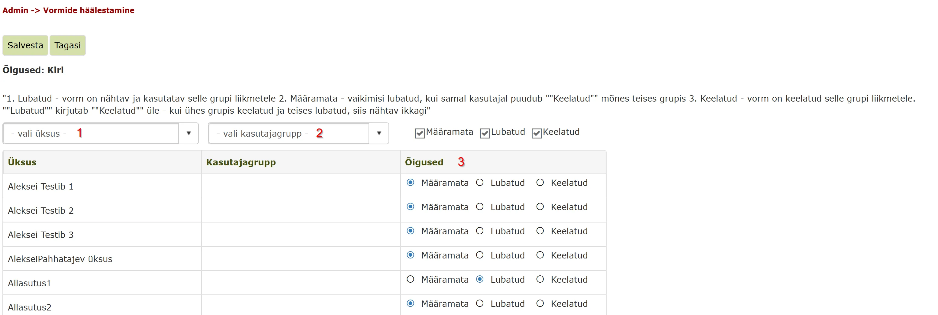 When creating a new form, rights are by default in Undefined status, which makes the form visible to everyone. Separate rights assignment is only necessary if you want to restrict form visibility to certain units or specific user groups.
If a user belongs to multiple user groups, rights apply according to the following hierarchy (from strongest to weakest):
- Allowed (strongest)
- Forbidden
- Undefined (weakest)
For example: if a user has undefined rights in one group and allowed in another, the allowed right remains in effect because it's stronger.
Adding Panel to Form
Go to Admin -> Form Configuration.
Click on the desired form name.
At the bottom of the form, you can see Panels, which shows a list of panels used on forms. Select appropriate options by checking the desired checkboxes. After making selections, save.
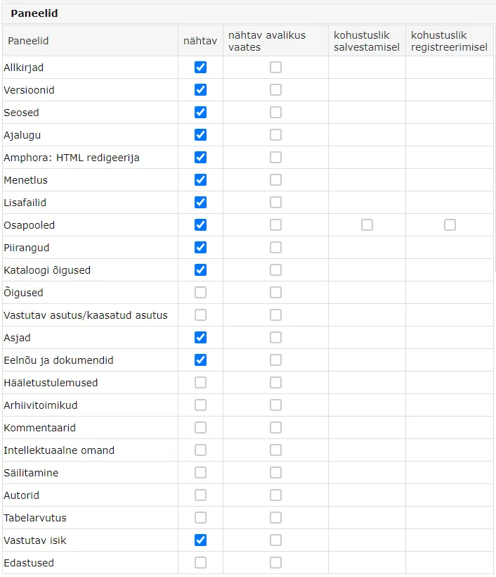 Currently, the following panels are no longer in use: Responsible organization/involved organization, Voting results, Intellectual property, Retention, Authors, Spreadsheet calculation. Adding checkmarks to these doesn't do anything.
Next to Panels, you can also see Static Fields. The selections made here determine which metadata fields are visible in the document registry public view. For the "Number" field (and also some other metadata fields), you need to change the publicity settings of the field from under the wrench icon.
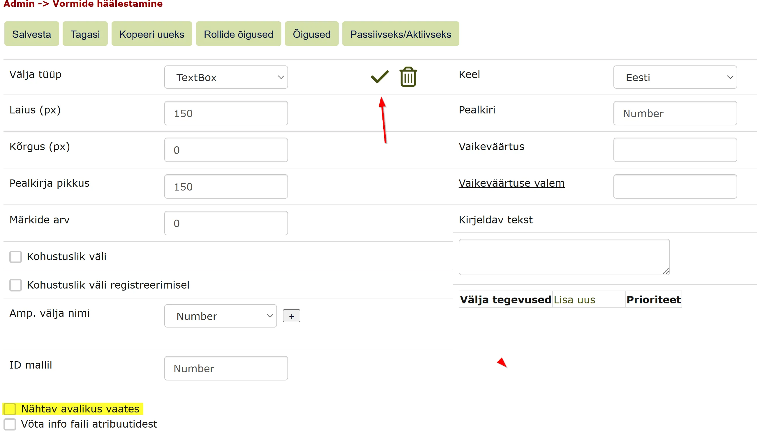
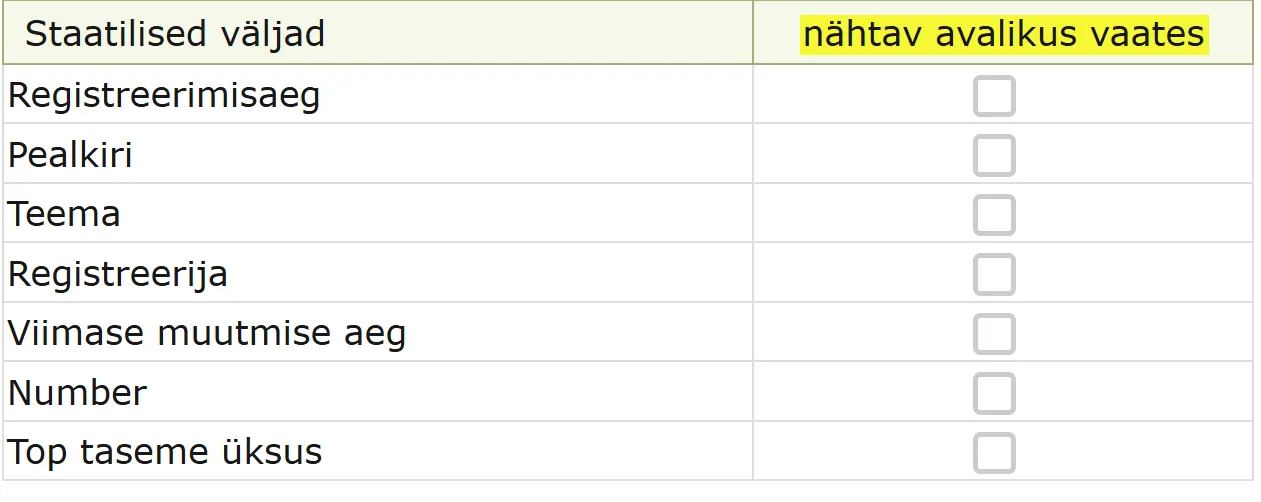 Example of configuring metadata field "Number" for public view:
Find Number in form configuration. Click on the wrench icon next to it.
 In the opened view, check the option "Visible in public view" and Save (from the green checkmark). Also save the updated form configuration.
 ***
***
Adding New Writing Form
-
To add a new form, click on the Admin module in the left menu of the system. From the opened submenu, click the Form Configuration link.
-
The system opens the Admin -> Form Configuration form. Click the Add New button.
-
A window opens where you need to fill in the fields under the System Configuration panel. Select Documents as the module.
-
Click the + sign next to the dropdown on the right of the Upload Method field.
-
The system opens a form where you select Documents from the dropdown next to the Module field and Written Document Category from the dropdown next to the Type field.
-
Write the upload form name in the box after the Name field, you can write the name in other languages in addition to Estonian.
-
Click the Save button. The system opens the Admin -> Form Configuration form.
-
To add fields to the form, click on the saved form title in the form list in Admin -> Form Configuration. The system displays the form configuration data saved in Admin -> Form Configuration and automatically for a new writing form, there's a Catalog field. There can be one of this field per form. If desired, this field can be deleted and added later (for example, if you don't want the Catalog field to be at the beginning of the form).
-
To see data about the field, click on the wrench image. The system opens field data instead of form configuration data. To save changes, click the green checkmark. To delete the field, click the trash bin icon.
-
New fields can be added either to the right or below. To add a field below, click on the existing field below which you want to add a field, on the downward arrow on the right.
-
To add a field to the right, click on the existing field next to which you want to add a field, on the rightward arrow on the right.
-
The system displays an empty box in the location where you want to add the field and field data instead of form configuration data.
-
All form elements can be added to the writing form exactly the same way as to the upload form.
Additional Field for Contract Attachments
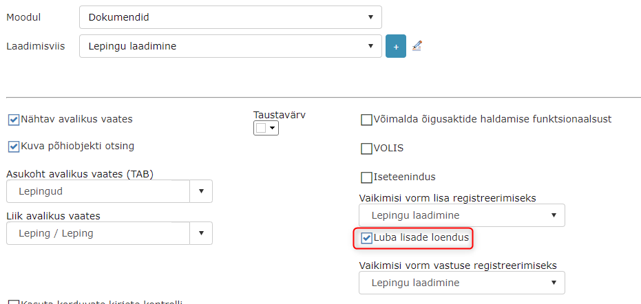
When adding a contract, it's possible to enter the number of attachments. For this, a separate "Number of Attachments" field was added where it's possible to enter the attachment number. This functionality may be useful in situations where multiple attachments have been added to one contract and the next attachment should get not -1 as a number, but for example -5.
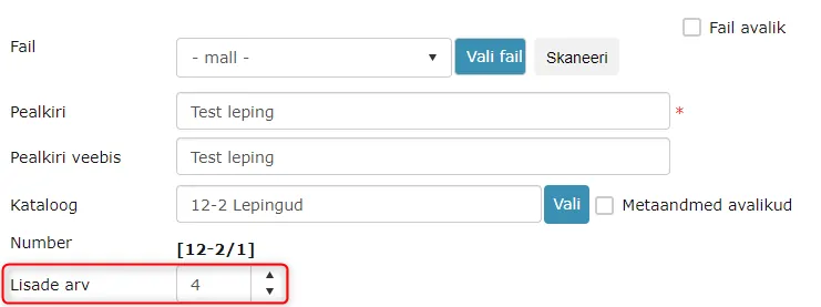 If an attachment is registered to the contract shown in the picture above, it gets the number 12-2/1-5.
The "Number of Attachments" field is disabled by default on all forms. It can be turned on/off in Admin -> Form Configuration -> Form Settings -> Allow attachment counting checkbox.
 ***
***
Form Deletion
To delete a form, go to Admin -> Form Configuration.
To delete a form, click on the trash bin button on the same row where the form to be deleted is located.
 ***
***
Copying Form as New
To copy a form as new, select the form you want to copy as new and click on the form name.
The system opens the desired form. Click the Copy as New button at the top. The system opens Admin -> Form Configuration, where the copied form name is ?.
Click on the name ? and then on the + sign next to the area to the right of the Upload Method field.
The system opens a form where you select Documents from the dropdown next to the Module field and Uploaded Document Category from the dropdown next to the Type field.
Write the upload form name in the box after the Name field, you can write it in other languages in addition to Estonian.
Click the Save button.
Making Form Active or Inactive
In form settings (Admin -> Form Configuration), it is possible to make a form inactive. An inactive form can later be made active again. For this purpose, the form settings contain an Inactive/Active button.
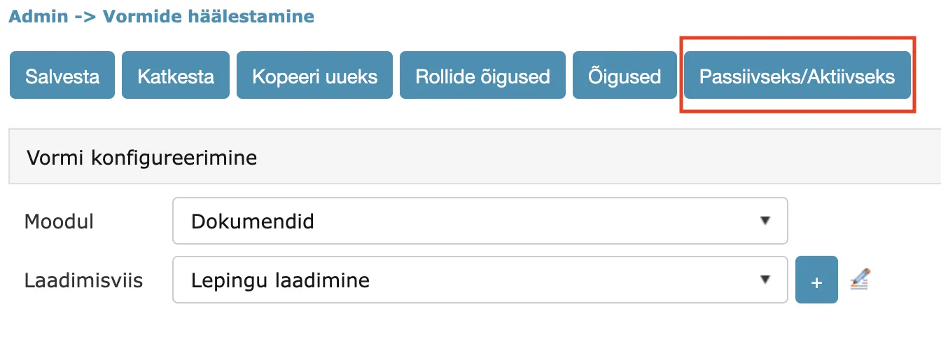
An inactive form is no longer visible in form selections. New objects cannot be created with this form. Existing objects that were registered with this form remain visible and editable.
Mandatory Responsible Person Panel
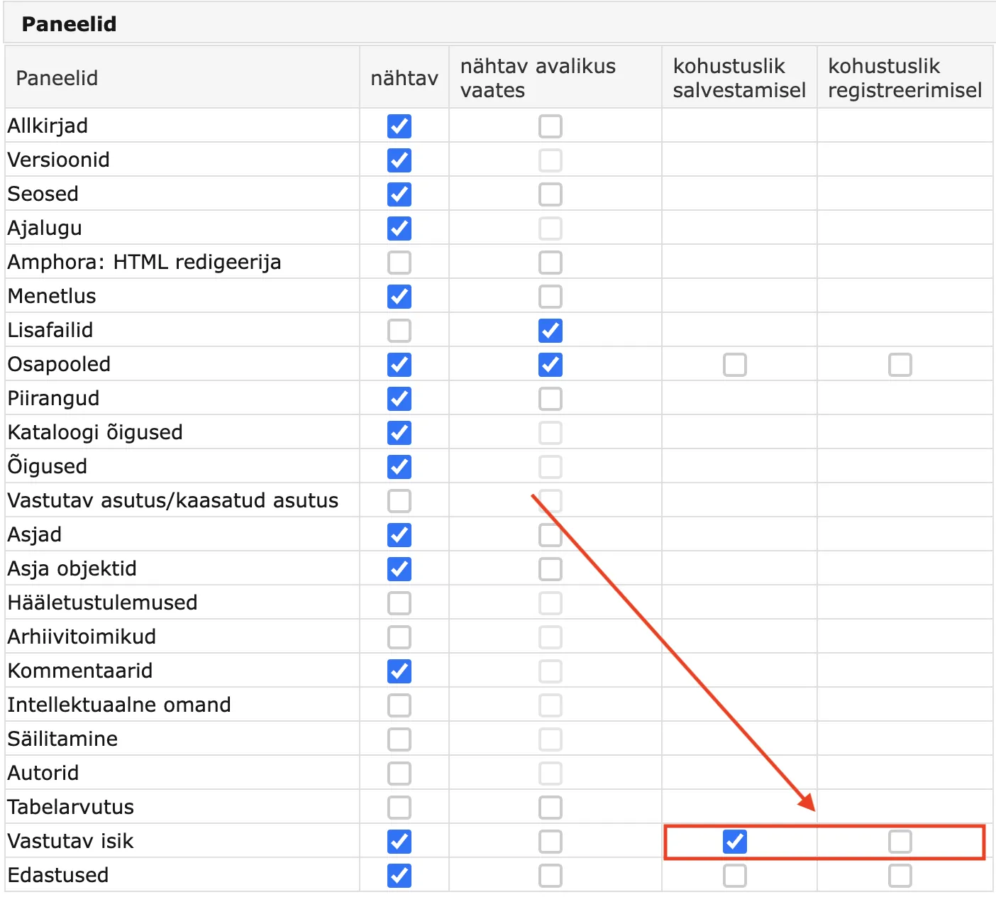
In form settings, you can make the Responsible Person panel mandatory when saving a document or case. A mandatory Responsible Person panel means that a responsible person must be selected when saving the document/case. If no responsible person is selected, Amphora displays the error message: Adding a responsible person is mandatory.
The setting is located in Admin -> Form Configuration under the form's panels next to Responsible Person. Available options:
- mandatory on save -- a responsible person must be selected when saving.
- mandatory on registration -- a responsible person must be selected when registering (useful when drafts are enabled).
Both options can be enabled at the same time.
Mandatory Deliveries Panel
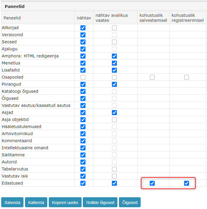
In form settings, you can make the Deliveries panel mandatory. A mandatory Deliveries panel means that the document must have at least one communication (either Incoming or Outgoing direction) when saving.
If no communication is present, Amphora displays the error message: Adding a communication is mandatory.
The setting is located in Admin -> Form Configuration under the form's panels next to Deliveries. Available options:
- mandatory on save -- a communication must be added when saving.
- mandatory on registration -- a communication must be added when registering.
Adding Default Responsible Person to Document and Case Forms
In form settings (Admin -> Form Configuration), you can assign a default responsible person to each Document and Case form. Additionally, you can specify that Amphora should create a work task (For Completion task) for the responsible person.
NB!
The Responsible Person panel must be activated on the form. This can be done in the same form settings (Panels).
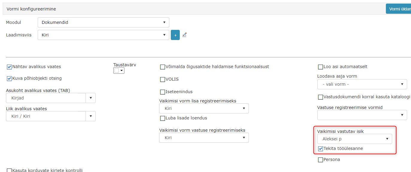
If a responsible person is selected on the form and the Responsible Person panel is activated, Amphora always adds the responsible person when creating a new document with this form. If the Create work task checkbox is also enabled, Amphora adds that checkbox as well. The responsible person can always be changed or removed.
Additionally, in form settings you can enable the Create work task checkbox without selecting a responsible person. In this case, no responsible person is selected by default, but when a user manually selects a responsible person, the Create work task checkbox is automatically enabled.
Removing Main File Field from Upload Form
On Document Upload forms, it is possible to remove the main file field. This cannot be done before the form's first save, because Amphora adds the main file field only after the first save.

NB!
If at least one document with a main file has already been uploaded using this form, the main file field cannot be removed.
HTML Text Support in Form Elements
Form element titles support HTML tags, for example <br> (line break element). Amphora displays these correctly both in the form edit view and the read view.
Default Value Formulas for Data Transfer
Form fields can use default value formulas that automatically transfer data from the source document to follow-up documents, response documents, and document attachments.
The formula format is =source.amphora_field_name, where "amphora_field_name" is the Amp. Field Name of the field on the source document's form.
Example: if the source document's form has a field named customer_name and you want it to carry over to the response document, enter =source.customer_name in the Default Value Formula field in the response document form's field settings.
Supported field types: TextBox, CheckBox, DropDownList, Date, DateTime, Deadline, RadioButtonList, URL, Number.
NB!
The field type must be the same on both the source and target document forms.
Response Document Numbers via Catalog or Case Counter
By default, a follow-up or response document receives its number based on the source document (e.g., if the source number is 8-6/223, the first response gets number 8-6/223-1).
In form settings, there is an option For response documents, use catalog or case counter. When enabled, the follow-up or response document receives its number from the catalog or case counter, depending on the catalog configuration.
The setting is located in Admin -> Form Configuration under the form settings.
Last modified: 09 October 2026, 15:13:44